The Simulator
About the Simulator
Overview
The Simulator is an interactive tool for exploring stratospheric aerosol injection (SAI) and its potential climate impacts. It is meant to help researchers, policymakers, and the broader public see what SAI could mean for our planet’s climate decade by decade.
Even under optimistic scenarios where emissions fall rapidly and carbon removal scales up, we are likely to face serious near-term climate impacts. The Simulator lets users explore what adding SAI to that mix might do — not as a prediction, but as a way to understand trade-offs.
It is part of a broader effort to democratize access to climate tools. Running a full climate model can take weeks of supercomputer time and deep expertise, and the outputs and analyses are hidden behind paywalls, written in scientific jargon, and often explore the effects of only one SAI deployment scenario (among millions of potential scenarios). With the Simulator, you can explore a broad range of comparable results in seconds, built from thousands of pre-run simulations.
The hope is that by making these dynamics visible and explorable, we can deepen conversation around climate intervention.
Like all modeling, the Simulator has limitations. Its results depend on the underlying simulations used to build it, which do not capture all feedbacks, variability, or sources of uncertainty in the climate system. These results are intended to help users understand trends and trade-offs rather than to predict precise future climate conditions.
Methodology
Under the hood, the Simulator is built from a simple idea: you don’t need to rerun a full Earth System Model every time you want to explore a new scenario. It uses a technique called “pattern scaling” to estimate regional climate responses (like temperature and rainfall) based on global mean temperature.
This approach is validated against full climate model runs (see Visioni et al., 2023), and described in detail in Farley et al., 2025 and the v1.0 Emulator Explainer (PDF).
The Simulator combines:
- A simple emulator for global mean temperature (similar to FaIR),
- Regional scaling patterns from full climate models, and
- A set of algorithms that translate user choices — like start date or target temperature — into required injection amounts, costs, and logistics.
That means you can see, instantly, how a later start date or a tighter cooling target would change outcomes, both globally and locally.
Publications and Presentations
The simulator has been cited in publications, reports, and external write-ups, including:
- Simulating the Impacts of SAI Deployment — blog overview of the methodology and first release
- v1.0 Emulator Explainer (PDF) — technical overview
- The Stratospheric Aerosol Injection (SAI) Simulator: An Open-Source Web Tool for Exploring Climate and SAI Deployment Scenarios — submitted for publication
Explore
You can try the Simulator directly at simulator.reflective.org. Start with the default scenario, or follow the walkthrough in the User Guide below to build your own.
The full Simulator codebase is publicly available on GitHub, including instructions for downloading the open access training data.
User Guide
Introduction
This guide provides a walkthrough of the Simulator’s core functions and helps you begin exploring scenarios related to Stratospheric Aerosol Injection (SAI).
You will start by learning how to build a scenario, then move on to visualizations and exploring regional effects. Finally, we will look at the advanced options for custom scenarios.
Start Up
When you open simulator.reflective.org, you will see the welcome screen. If a message appears saying “desktop required”, adjust your browser window to a wider layout.
From here, you can either jump straight into exploration or navigate through the introductory walkthrough to learn more about SAI. If you are new to the topic, we recommend spending a few minutes on the walkthrough before diving in.
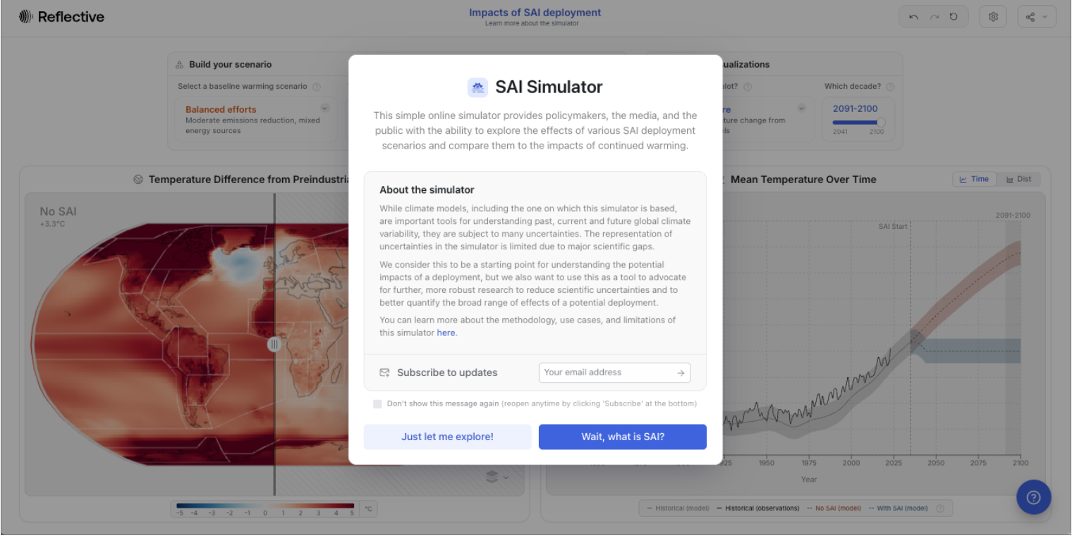
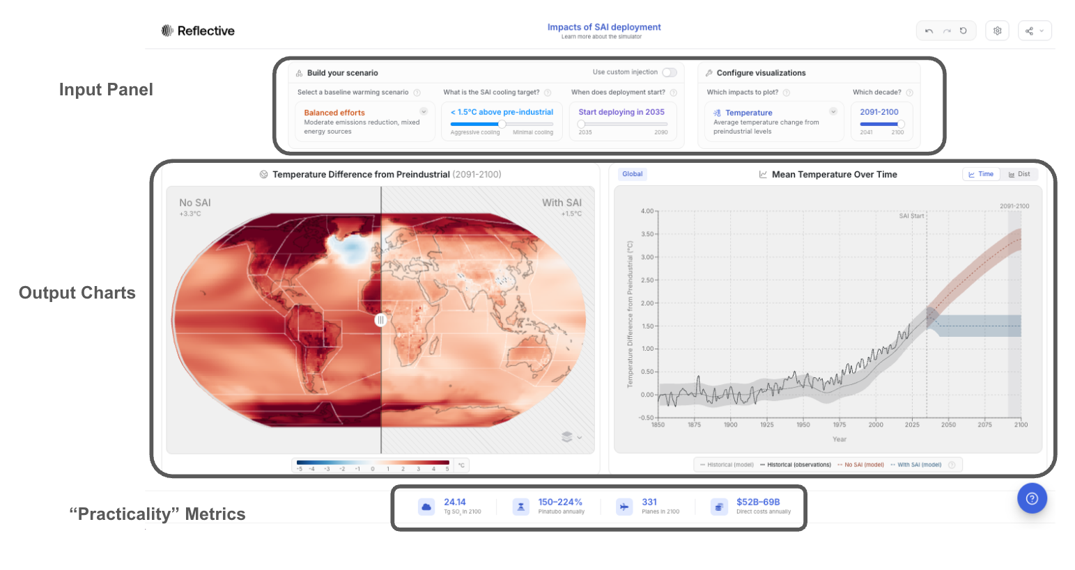
Once the pop-up closes, you will arrive at the main Simulator interface, which has three key components:
- Input Panel – where you define your scenario and configure how results are visualized.
- Output Charts – a map and a plot that show the simulated impacts of your chosen scenario.
- Metrics Box – a summary of deployment requirements and approximate costs.
Quick Tour
- In the input panel, you will find two main menus:
- Build Your Scenario – define the SAI deployment and climate assumptions.
- Configure Visualizations – choose what climate impacts and decades to display.
- The map and plot visualize your scenario’s outcomes for a world with and without SAI.
- Use the slides on the map to toggle between these views in the map.
- On the righthand plot, you can switch between a plot that shows how a given impact changes with time and a distribution.
- The metrics box (bottom of the screen) shows what a deployment would involve:
- annual SO₂ requirements
- their equivalence to volcanic eruptions
- estimated aircraft fleet size
- deployment costs
(Note: these metrics are rough estimates. There has been remarkably little engineering work done to date, so we must make significant assumptions about the payload of potential planes and flight costs.)
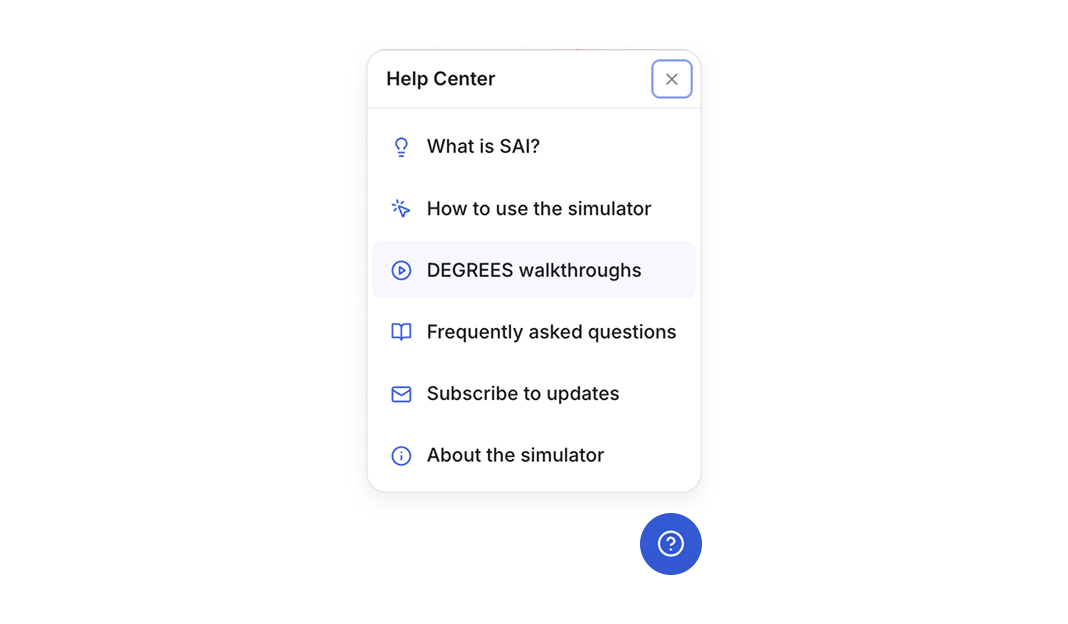
At the top of the page, you will also find menu and sharing options—these are covered later in the Advanced Features section. For additional help, click the blue question mark icon in the lower-right corner to open the Help Center and FAQs.
Simulation Inputs: Building a Scenario
Let’s begin by selecting the Simulator inputs. Although the Simulator opens with a default configuration and it can be tempting to start exploring the maps, it is important to understand the assumptions underlying the visualizations.
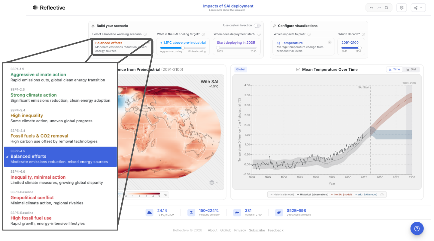
Selecting a baseline warming scenario:
You start by selecting a baseline warming scenario. This input captures fossil fuel emissions and decarbonization for this simulated world in which SAI is carried out. These scenarios are standard amongst climate scientists (you can learn more here).
When selecting a scenario, consider: will the world make considerable progress towards decarbonization? Will fossil fuel consumption increase? As a default, we have chosen SSP2-4.5, the “middle of the road” scenario now seen as most likely.
Next, you choose the parameters of a deployment: your SAI cooling target and when you would like the deployment to start.
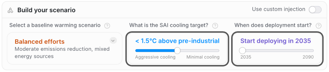
What is the SAI cooling target?
This target is the maximum allowed global temperature increase above pre-industrial levels (a common baseline used to measure human- caused climate change). The amount of SO2 injected adjusts to maintain this temperature each year. The SAI cooling target will be set by default to hold temperatures at 1.5C, consistent with meeting the Paris Agreement targets.
You can move the slider to the left and right to see what the effects of a more or less aggressive cooling target would look like. The scenario it models, in this mode, is an optimized one: injections at four latitudes, with a controller algorithm that adjusts amounts to keep cooling relatively even across the globe.
When does deployment start?
You will set the deployment start date with the slider, just like the cooling target.
When setting the deployment start date, you will note that later deployment starts may trigger a “high rate of cooling” warning message – these are scenarios that are, likely, infeasible or undesirable because they would require cooling the planet faster than current rates of warming. High rates of temperature change could be harmful to certain ecosystems.
Simulation Inputs: Configuring Visualizations
The Simulator translates your inputs into global climate impacts such as temperature and precipitation. Normally, this requires weeks of compute time on a supercomputer. Here, it updates instantly, because the Simulator is built on thousands of pre-run climate model simulations.
Which impacts to plot?
You can select which of the impacts you want to visualize from the “Which impacts to plot?” drop down.
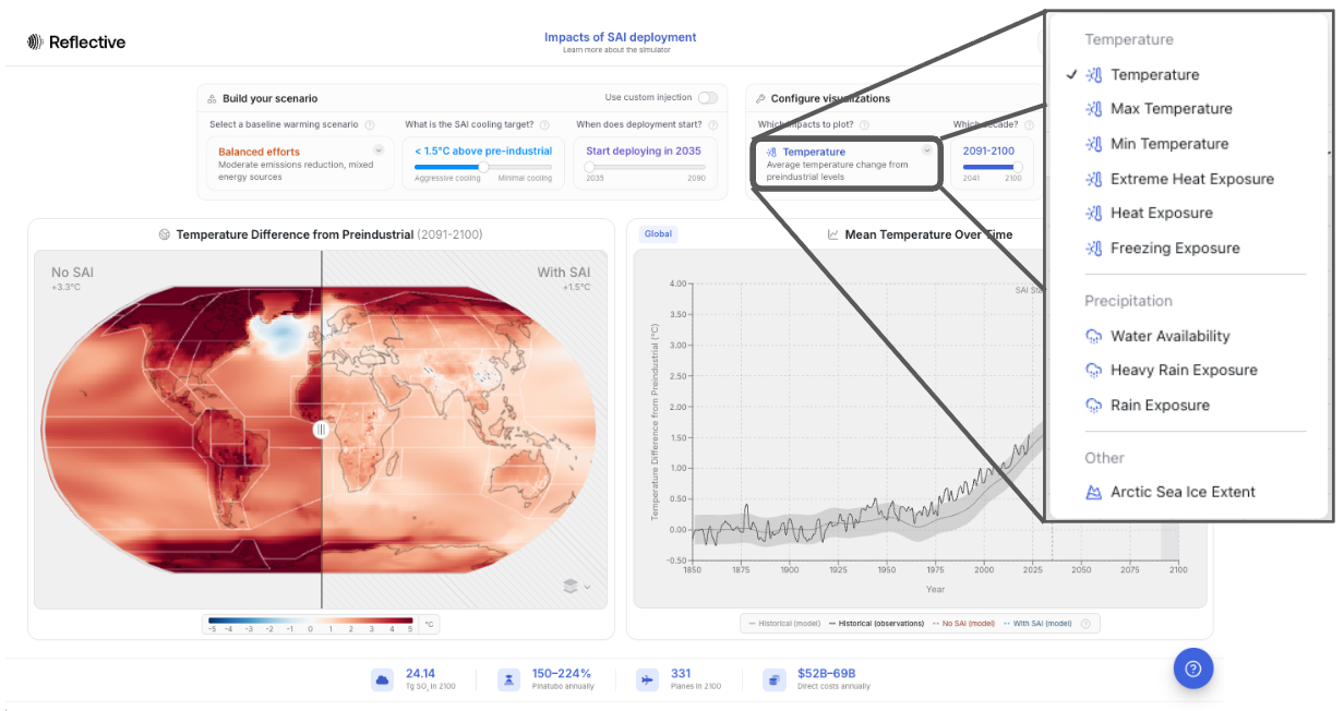
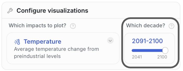
Which decade?
Finally, you can select the decade you want to visualize, up until 2091-2100. It is the result for the selected decade that will be visualized in the map on the left, and in the distribution on the right when in distribution mode (not pictured here). As you move the slider to different decades, you can visualize the impacts SAI will have over time.
Visualizing a Scenario
We are now ready to interactively explore the maps and data.
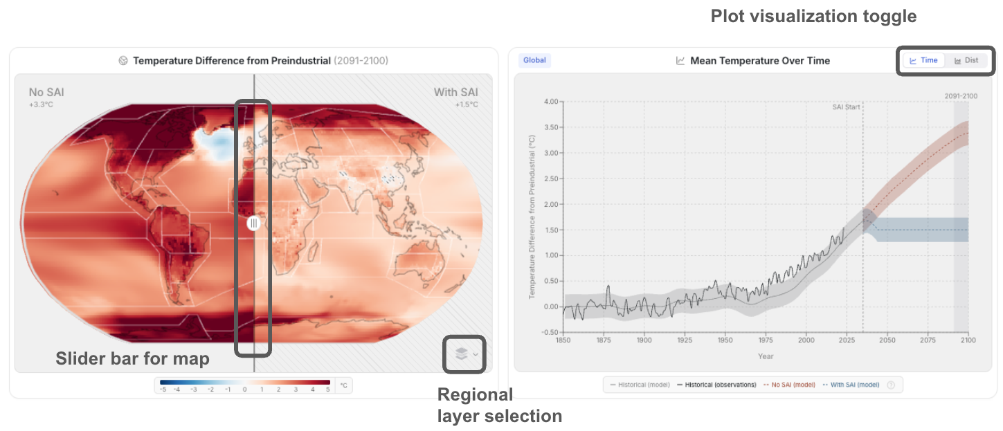
The Map (Left Panel)
The map on the left is designed to make it intuitive to understand how the risks of climate change compare to the risks of a potential SRM deployment. This is the risk-risk framework that is critical to understanding SRM. You can slide this slider back and forth to visualize, for a given decade, how those impacts compare.
You might notice that the map is carved up into distinct, clickable regions. You can adjust how regions are defined by clicking the layer selection icon in the bottom right corner of the map. Regional view is discussed more below.
The Plot (Right Panel)
In the plot on the right, you see a more direct comparison between an SAI and non-SAI world. In the example of temperature, we see that temperatures would continue to rise without SAI (the red line), while in the blue line (the SAI scenario) temperatures hold flat at your cooling target (in this case, 1.5C above pre-industrial temperatures). The shaded regions around the curves represent model uncertainty, and are computed by running three variants of the same model and looking at their spread in a given year.
Note: These results represent model-based projections, not precise predictions. They are designed to illustrate trends and trade-offs rather than provide forecasts for a specific time and place.
Regional Exploration:
You can also click into a given geography to get more regional data. That will update the charts on the right. Just click the geography again to get back to the global view. If you want to change the way a region is defined, you can click on the regional layer selection icon on the bottom right of the map.
Note: For some impacts, it might look like there is data missing in some regions because the colorscale is set to highlight regions with high populations. To really understand what is happening in all regions, be sure to click into the regional views.
Advanced Features
Custom Injection:
The Simulator provides an advanced “custom injection” mode where you can customize how much aerosol is injected, by decade, at which latitudes, rather than targeting a specific temperature.
To access the custom injection menu:
- Click the gear icon on the top right of the page
- Toggle on the “Custom injection” option in the drop down menu
- Toggle “Use custom injection” in the “Build your scenario” box.
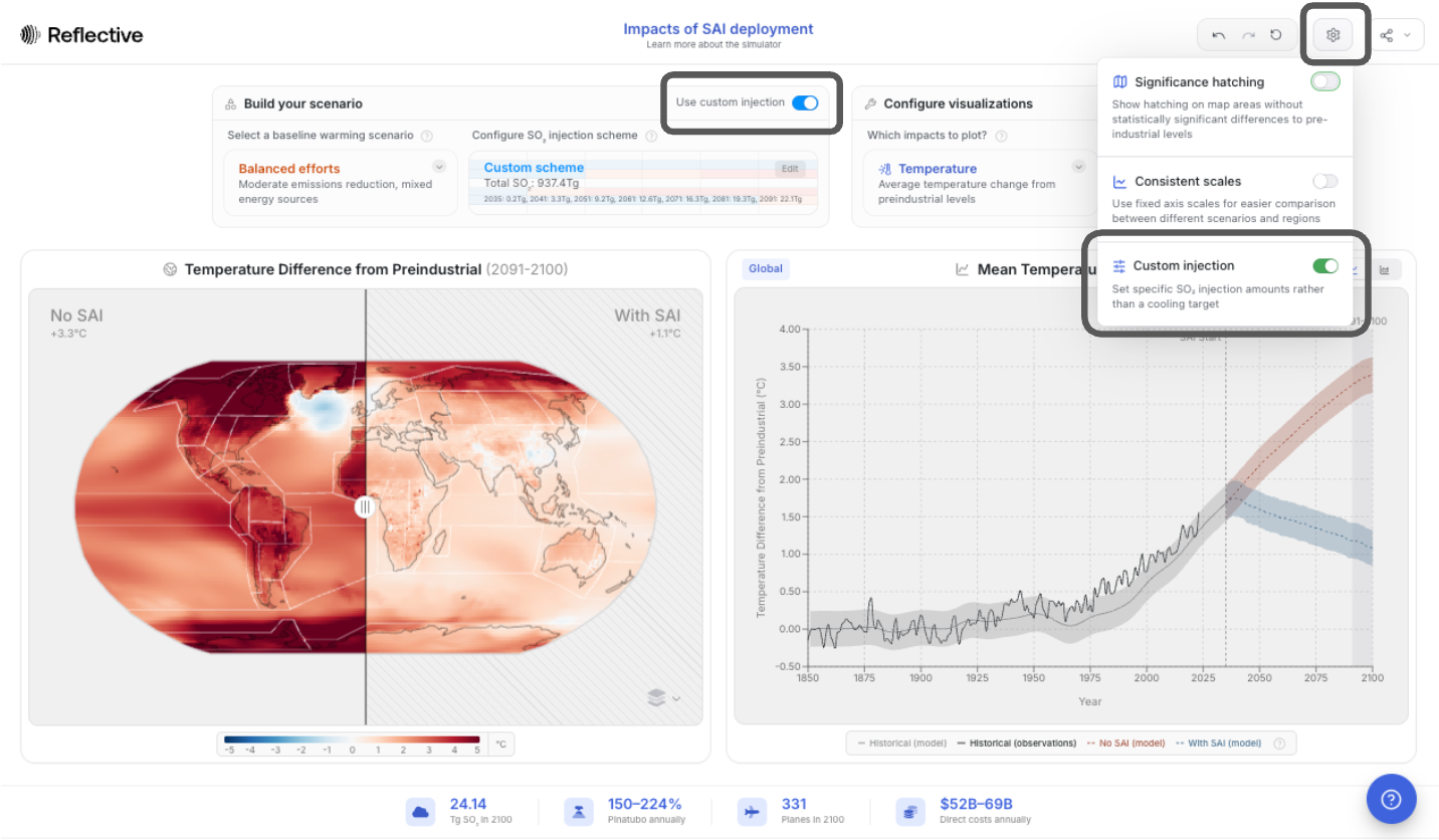
You can then click on “Custom Scheme” to open up an editing menu. You can choose from one of the provided templates, or fully customize your own scenario by clicking into the individual cells and inputting an amount of SO2 for injection. (Note: the values correspond to annual injection amounts during the decade rather than a total amount for the decade).
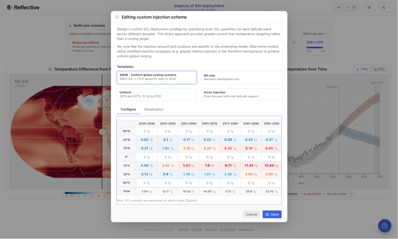
If you design an injection scheme that forces cooling at a rate that exceeds the current warming, you will again get a “high rate of cooling” warning message.
Additionally, in some cases, especially when looking at custom injection scenarios, visualizations can take a bit longer to load — sometimes up to 30 seconds. That does not mean the scenario has broken; it just requires a little patience.
Exporting Data
Simulation outputs are available for download as a NetCDF file, a standard format for storing multidimensional climate data. To export, click the share icon in the top right of the page and select "Download NetCDF" under the Export Data section.
SAI Research in Context
To help you understand how scientists actually use the tool, we have built in a set of guided scenarios — short, narrated demonstrations where experts walk through examples of their own analyses.
You can access these guided walkthroughs by clicking the blue question mark icon in the lower-right corner of the screen, then selecting “Degrees Walkthroughs.”
Connect with us!
We really value your input: If you are enjoying the simulator, if you have an idea for an improvement, if something is unclear, if you have any feedback at all, we would love to hear from you. Please share your thoughts using our feedback form. Your thoughts will directly shape future versions of this tool!
Launch Simulator
And don’t forget to subscribe to updates!
Subscribe